Dine-a-Bowl
Overview
Dine-a-bowl is a food delivery app that strives to deliver healthy and delicious food right to your doorstep. The app promotes a wide range of local restaurants and international cuisines. Dine-a-bowl caters to young and busy professionals and individuals who struggle to find time or the ability to prepare meals.

Problem
Now more than ever, individuals and young professionals struggle to find time to prepare hearty, homemade meals.
Solution
Design a mobile app that allows users to order meals quickly and efficiently, letting them return to their work or daily activities.
My Role
-
As a user experience designer, my role is to design a food delivery app from concept to delivery.
Timeline
- Overall: 8+ weeks
- Discovery & Research: 2+ weeks
- Design & testing: 6 weeks
Responsibility
-
Conducting user interviews.
-
Creating paper and digital wireframes.
-
Turning them into low and high fidelity prototype on Figma.
-
Conducting usability studies at different stages.
-
Accounting for accessibility for inclusion and iterating on designs.
My Design Process
Empathize
Define
Ideate
Prototype
Test
Result

User Research Summary
In order to best understand user motivations, needs and pain points, interviews were conducted and an empathy map was designed. Through research, our target consumers were identified as busy professionals who lack the time and ability to make home-cooked meals.
Our hypothesis was confirmed that time was a major factor that limits young professionals from having hearty meals. Other user problems include dietary restrictions and out-of-work obligations that make it difficult to enjoy a good meal.
User Research: Pain Points

Persona’s

Dya
Dya is a young professional who needs to save time on preparing food so that she can spend time with her friends.

Bostjan
Bostjan is an individual with dietary restrictions who needs to easily find keto-friendly options so that he can enjoy meals with his family.
User Journey
Mapping Dya’s user journey that highlights areas where we can make improvements for a better user experience.

Goal Statement

User Flow

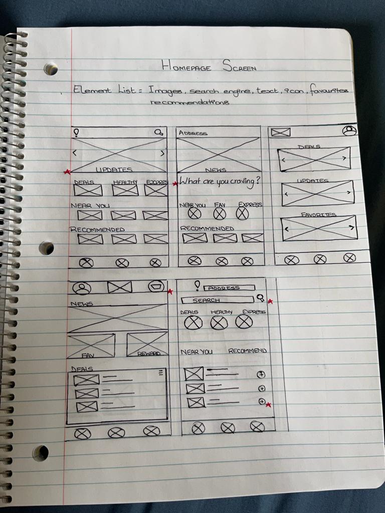
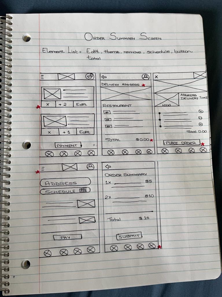
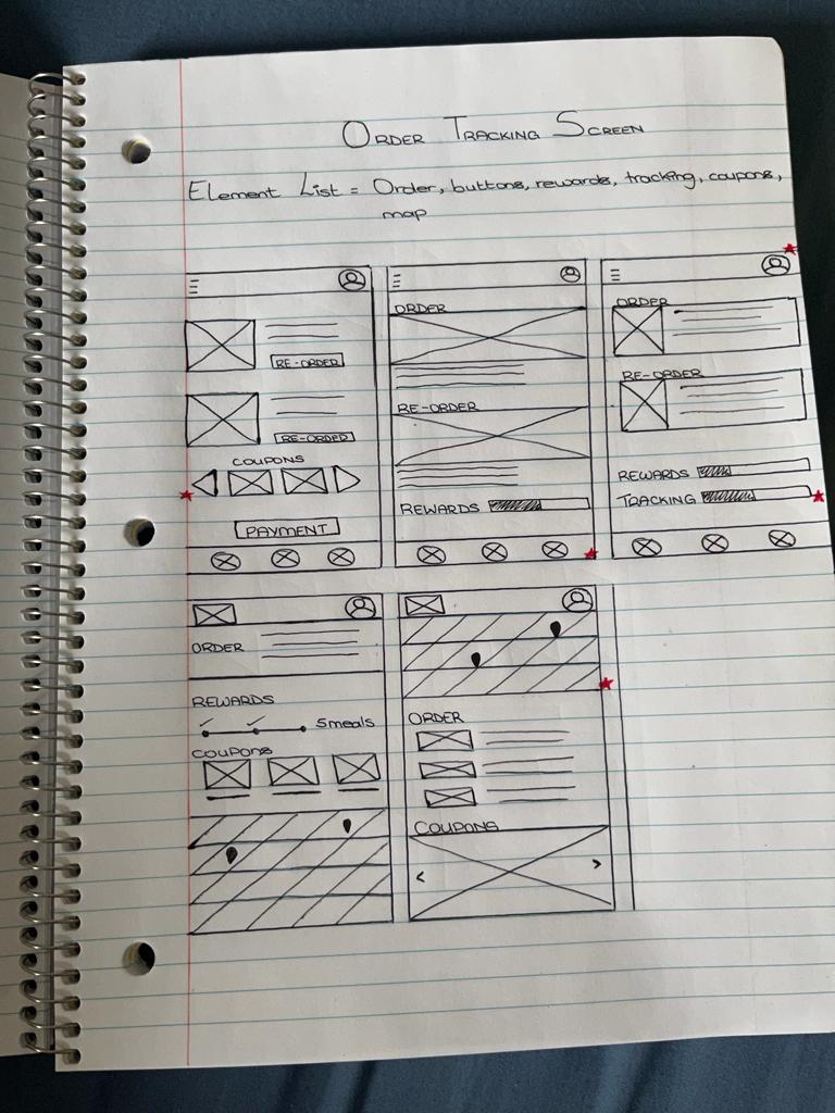
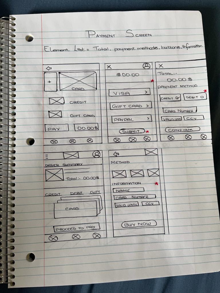
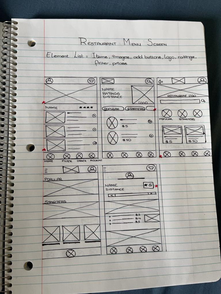
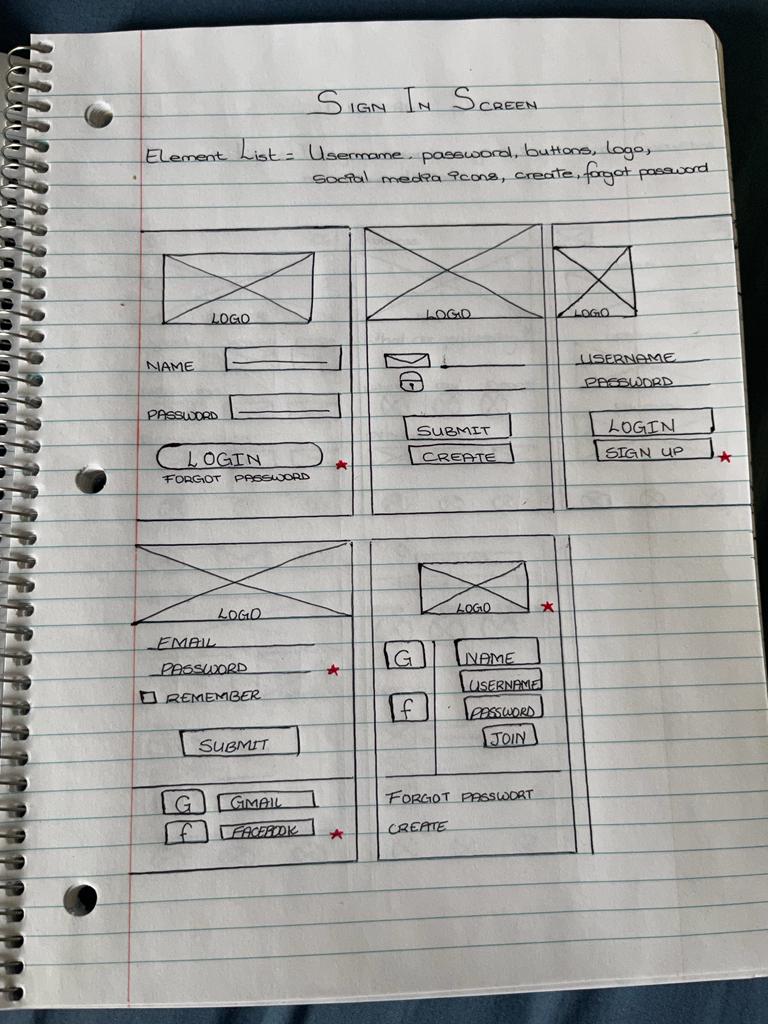
Paper Wireframes
Overview
With the information gained through my research, I was able to draft iterations of app screens on paper to ensure that the elements that made it to the digital wireframes effectively addressed the user’s pain points. The elements added in the designs prioritize the need of a quick way of ordering food to allow users to save time.
* Stars were used to mark the elements of each sketch that would be used in the initial digital wireframes.
Digital Wireframes
Overview
As the design proceeded to digital, I made sure that my designs were based on the feedback from my research. I created a digital version of the wireframes in Figma and proceeded to test it with users.
One of the key user need to address in the designs was easy navigation. Through easy navigation process, user will be able to find what they’re looking for effortlessly allowing them to make their order easy and fast.


Low-Fidelity Prototype
Overview
Using Figma, I created a low-fidelity prototype by connecting a set of digital wireframes. The primary user flow was built to allow users to complete the task of food ordering. The prototype could also be used in a usability study to ensure that it solves the user problem.
Usability Study: Findings

To get an initial insight into the app’s usability, two rounds of usability studies were conducted by recruiting 5 participants to test the low-fidelity prototype and then the high-fidelity prototype. Findings were gathered by observing participants interact with the app and designs were refined from wireframes to mockups.

Mockups

Mockup 1
Mobile App – March 2022Based on the insights obtained, a few changes were made to the digital wireframe to improve usability. I added a section to add promotional codes allowing users to receive discounts on meals and delivery fees. I have also made all the elements more interactive using hyperlinks in all screens.

Mockup 2
The second usability study revealed frustration with the repetitiveness of the on-boarding process during ordering. I added a Remember me checkbox to allow returning user to skip the sign-in process.

Mockup 3
Through the usability study, we also discovered that users wanted an easier way to adjust the quantity of items. The current setup was found to be confusing. I added a simple Plus and Minus icon to the side of each item added to the cart.

High-Fidelity Prototype
Overview
The final high-fidelity prototype presented has refined wireframes with visual design elements, color, typography, layout and cleaner designs of the user flow. It meets user needs for an easier and fast method of food delivery.
You can interact with the prototype here
Accessibility Considerations

Next Steps
01
Conduct another round of usability test with a wider range of participants to gain a better understanding of user experience.
02
Conduct another round of user research to identify new user pain points.
Learnings
While designing the Dine-A-Bowl app, I learned the importance of usability study and peer feedback on the designs and user experience. Your first ideas for the app are only a stepping stone to begin, but the studies help build and refine them at each stage. Each user testing gives new perspective, making the user experience satisfying.
Impact
The app stands out by offering a simple ordering process with a variety healthy and appetizing options. Designed for the busy lifestyle.